I find it very simple (just the way I like), original and flashing. I agree with previous comment about other colors, I've slightly modified it to match my desktop colors, I can send it to you so you can post it or post myself if you don't mind.
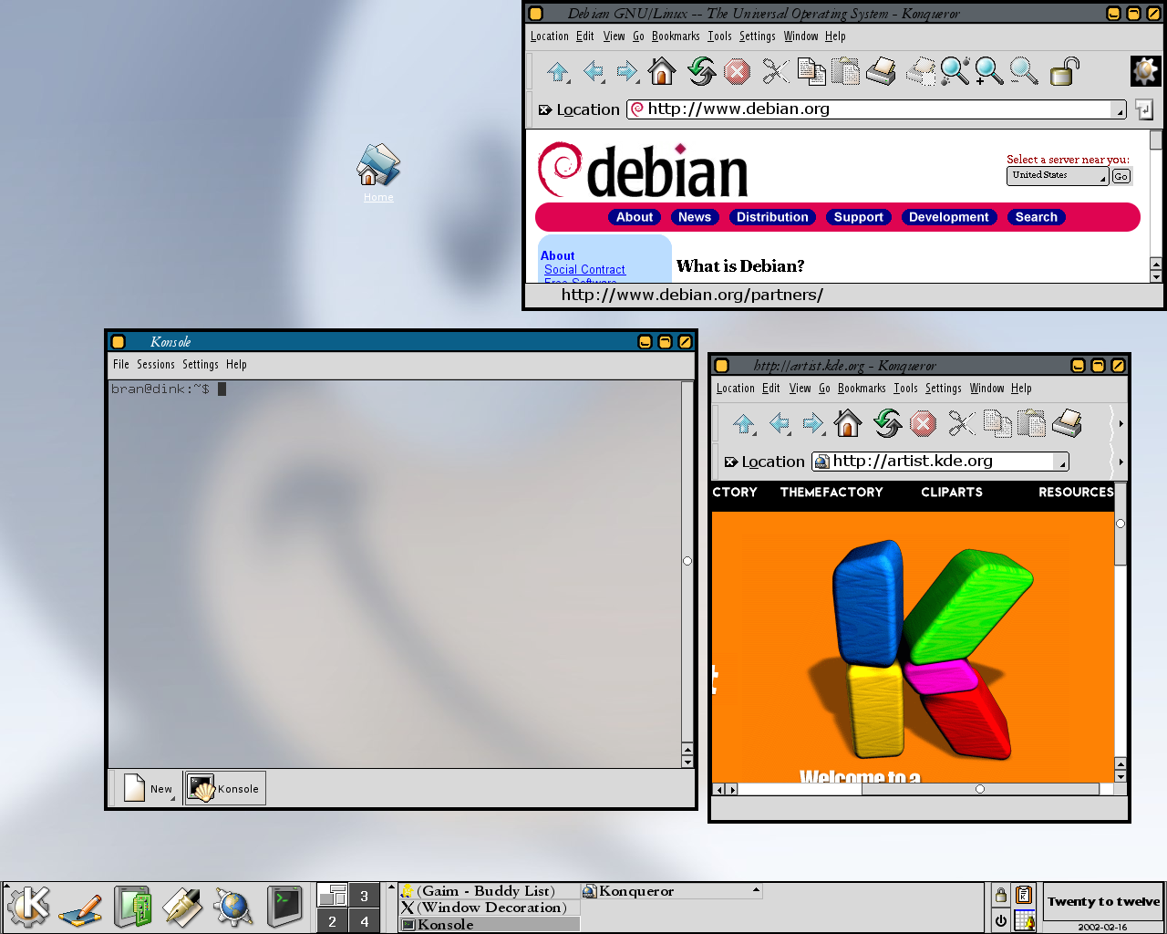
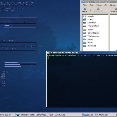
Or, as I'm thinking now, explain how to do it because it's very easy and it took ten minutes to me to do it, with no experience at all about it. Edit the file ~/.kde/share/apps/kwin/icewm-themes/bebop/default.theme (location may vary if you installed it system-wide or use other KDE version than mine 2.2, maybe), and change the lines ColorActiveTitleBar= and ColorNormalTitleBar= and put in them the color you want. That's all about the title bar. For the buttons, you need to change ten files in the same directory (I made it with GIMP). The files are close, maximize, menubutton, maximize and restore, ending with A and I standing for active and inactive, and everyone with the .xpm extension. Change with the colors you chose et voilà!
That's what I like about open source...
... good and original. just one suggestion:
make the border line thickness the same size as so as the black line under the titlebar. it would look more consistent imho.
100%
(Btw, i love that i had to register for 3 words of commentary.
When can we see, one-click on thumbnails to see previews please, leaving the title link to see the whole entry. I ask for it, so I guess I'll get it, or so the past has shown us. )


Ratings & Comments
12 Comments
Fits very nice with the rest of my system.
nice, i love that font what font is that in the pic?
I find it very simple (just the way I like), original and flashing. I agree with previous comment about other colors, I've slightly modified it to match my desktop colors, I can send it to you so you can post it or post myself if you don't mind. Or, as I'm thinking now, explain how to do it because it's very easy and it took ten minutes to me to do it, with no experience at all about it. Edit the file ~/.kde/share/apps/kwin/icewm-themes/bebop/default.theme (location may vary if you installed it system-wide or use other KDE version than mine 2.2, maybe), and change the lines ColorActiveTitleBar= and ColorNormalTitleBar= and put in them the color you want. That's all about the title bar. For the buttons, you need to change ten files in the same directory (I made it with GIMP). The files are close, maximize, menubutton, maximize and restore, ending with A and I standing for active and inactive, and everyone with the .xpm extension. Change with the colors you chose et voilà! That's what I like about open source...
I like it, it would probably look nice with other colors too.
Just wanted to thank you again for a very tight and clean look. Keep it up!
quite refreshing after all those 3d things that everyone makes... i like it!!
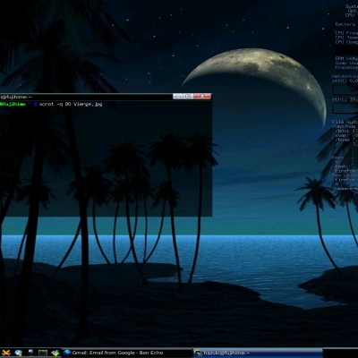
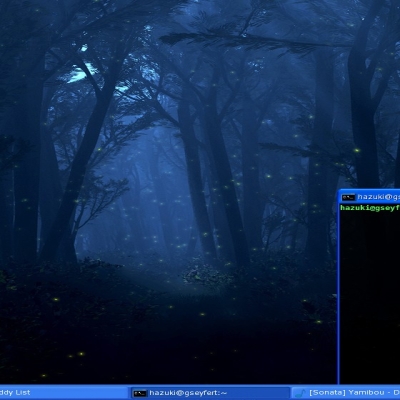
the wallpaper you're using? Thanks.
looks pleasant!
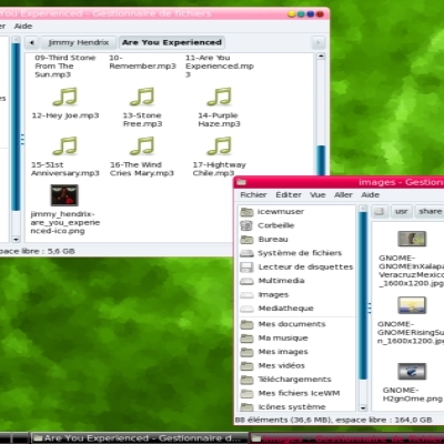
I used the built-in "web" style.
... good and original. just one suggestion: make the border line thickness the same size as so as the black line under the titlebar. it would look more consistent imho.
100% (Btw, i love that i had to register for 3 words of commentary. When can we see, one-click on thumbnails to see previews please, leaving the title link to see the whole entry. I ask for it, so I guess I'll get it, or so the past has shown us. )
Thank you for the great work!