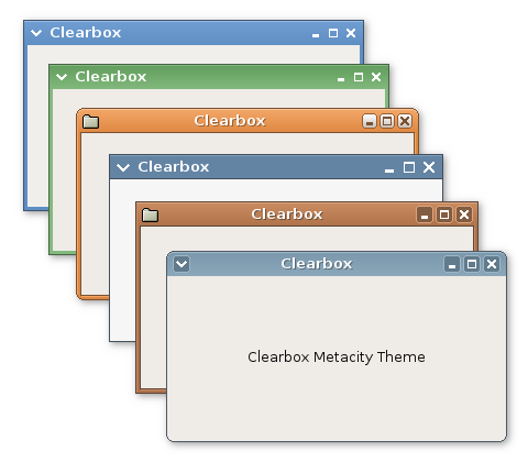
Description: A clean and fast metacity theme. Looks good with Clearlooks GTK2 theme but adapts to your current theme colors.
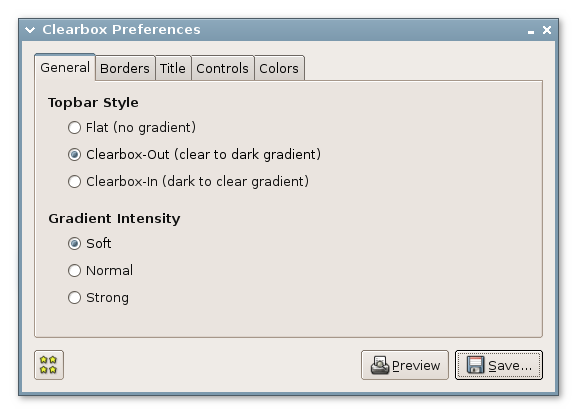
Clearbox is now fully customizable. A small GTK application allow configure the differents theme aspects, preview the theme and save it in the user themes folder.
The options that can be configured in the Clearbox theme are the following ones:
- Topbar style: Clearbox-out, Clearbox-in or flat - Gradient intensity: 3 levels - Square corners or rounded corners - Border width - Colorized or non colorized borders - Interior outline - 3D effect borders - Title position: left or center - Title text with or without shadow - Controls style: simple, dark frame or clear frame - Buttons size and gap - Button menu with arrow or application icon - GTK theme colors or custom colors
I really wanted to download, but I kept getting errors about the link. Finally went directly to sourceforge and got this message after searching.
The sourceforge.net website is temporarily in static offline mode.
Only a very limited set of project pages are available until the main website returns to service.
I'll have to remember to come back and try again sometime.
The issue I have is that at each of the bottom corners, there seems to be an extra pixel that creates some uglyness when the window border is dark and rounded. I'll upload a pic later. It's not too major--only one pixel, but it looks kind of funny
Great theme! Is there any way to round just the top corners for this theme and not all four corners? If there is not a way to do it in the configuration app, is there at least a way to hack it by hand? Keep up the good work. It would be amazing if this them had a glossy look to it like the Royale theme for Windows XP Media Center.
One of the best looking metacity themes I have seen that perfectly compliments Clearlooks.
My only gripe is that the pressed button colour doesn't seem to be taken from the current GTK theme and so is always yellow unless you specify your own colours for everything including the pressed buttons colour.
Would it be possible to create an option whereby the pressed button colour is taken directly from the GTK theme and makes one of the GTK theme colours either darker or lighter for the pressed button colours?
Thanks
I really like the clearbox-look theme, but I would like the application icon to be on the left menu button, instead of an arrow.
Is there anyway you could edit it somehow?
I love this theme and I'm a sf.net nut. I'd be thrilled if you'd make the following text go away from your project page.:
"This project has not yet categorized itself in the Trove Software Map."
If you get my drift. ;-)
Thanks.
speaking of buttons, aren't they too close to each other? I'm not a fitts law zealot but I think a little more space between the buttons would be more friendly.
I think that the size and separation of the controls is the suitable one. If you want a greater separation you can change it easy. Edit the metacity-theme-1.xml file and change the value of aspect_ratio in line 20 to 1,0 or 1.1.
Thanks for the commentaries.
thx.....already did
aspect_ratio name="button" value="1.1"/
also did ilishin's suggestion which everyone can appreciate
(lines 27 and 28)
distance name="left_titlebar_edge" value="0"/
distance name="right_titlebar_edge" value="0"/


Ratings & Comments
30 Comments
I really wanted to download, but I kept getting errors about the link. Finally went directly to sourceforge and got this message after searching. The sourceforge.net website is temporarily in static offline mode. Only a very limited set of project pages are available until the main website returns to service. I'll have to remember to come back and try again sometime.
hello mate, ur theme are fantastic but I got an issue with metacity's controls on the left (mac's like). If isn't a problem can u fix?
The issue I have is that at each of the bottom corners, there seems to be an extra pixel that creates some uglyness when the window border is dark and rounded. I'll upload a pic later. It's not too major--only one pixel, but it looks kind of funny
Great theme! Is there any way to round just the top corners for this theme and not all four corners? If there is not a way to do it in the configuration app, is there at least a way to hack it by hand? Keep up the good work. It would be amazing if this them had a glossy look to it like the Royale theme for Windows XP Media Center.
This application is great!! Thank you! Will you add support for "unfocused window" color?
Yes, I miss unfocused option too... But the theme and customizing App are GREAT
One of the best looking metacity themes I have seen that perfectly compliments Clearlooks. My only gripe is that the pressed button colour doesn't seem to be taken from the current GTK theme and so is always yellow unless you specify your own colours for everything including the pressed buttons colour. Would it be possible to create an option whereby the pressed button colour is taken directly from the GTK theme and makes one of the GTK theme colours either darker or lighter for the pressed button colours? Thanks
I really like the clearbox-look theme, but I would like the application icon to be on the left menu button, instead of an arrow. Is there anyway you could edit it somehow?
Nevermind, I didn't look closely enough.
Best metacity EVER! :)
keep going... take this theme to the next level
I love this theme and I'm a sf.net nut. I'd be thrilled if you'd make the following text go away from your project page.: "This project has not yet categorized itself in the Trove Software Map." If you get my drift. ;-) Thanks.
In case you haven't seen it http://gnomesupport.org/forums/viewtopic.php?t=9400&highlight=
that's just.... well it's excellent!
really good stuff, the app is amazing. great work.
Thanks for the simple yet elegant theme, but thank you more for providing a great tool to customise that theme. Keep up the great work.
the themer app is great!
I am sorry, This theme is just to plain. Looks to much like old m$ windows.. I gave it a good vote tho, The colors are nice. Cheers, Bandit
wowie zowie thats awesome! good job
Very nice. Could you remove padding from control buttons so that they take all are - with no dead pixels on edges? just like metabox does
speaking of buttons, aren't they too close to each other? I'm not a fitts law zealot but I think a little more space between the buttons would be more friendly.
I think that the size and separation of the controls is the suitable one. If you want a greater separation you can change it easy. Edit the metacity-theme-1.xml file and change the value of aspect_ratio in line 20 to 1,0 or 1.1. Thanks for the commentaries.
thx.....already did aspect_ratio name="button" value="1.1"/ also did ilishin's suggestion which everyone can appreciate (lines 27 and 28) distance name="left_titlebar_edge" value="0"/ distance name="right_titlebar_edge" value="0"/
Very nice. This is one of the best metacity I've ever seen. Great job :)
great. looks good. I use the ClearBox Out